San Francisco start-up Impulse is working on the next generation of home energy systems, with upcoming products that have the potential to revolutionise the way our homes operate and are powered. To help Impulse share its story, build momentum behind the brand, and position it as a key, forward-thinking player in an emerging market, BLOND was asked by Impulse to develop a new brand identity that could launch the brand to market. At the outset of the project BLOND proposed that the brand identity should subtly reference the technology that Impulse’s products will center around. Different brand concepts played with typographic and iconographic interpretations referencing various aspects of the energy technology.

The chosen route settled on the use of a wave symbol, which is embodied in the ‘M’ of Impulse. The wave symbol represents a voltage waveform, suggesting a powerful and rapid release of energy, and functions as a shorthand for the brand identity. It’s been refined into a bold symbol that evokes a forward-thinking brand with a clear vision.
Services:
Brand Strategy
Brand Identity
Art Direction
Web Design


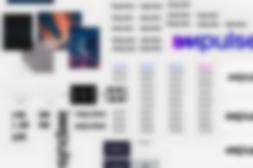
When stacked at an offset position, the negative space between the arches of the ‘M’ align into a lightning bolt, which is utilised as a playful nod to energy generation. A brand pattern was constructed by repeating the icon into a long wave format that can provide a background to brand assets such as banners or rolls of packaging tape. A digital-first logo, Impulse’s wordmark is monochromatic for high-contrast application, with a restricted size, placement, and use on white and black backgrounds only to ensure consistency across all communication touchpoints. A supporting ‘Digital Lavender’ rounds off the trio of colours forming the brand colour pallet, distinguishing the brand as confident, simple and considered.

A corporate typeface was found in a variable sans serif that is both technical and highly refined, with a considered monospace feature that allowed us to specify three weights that perfectly align with the rest of the identity. To round off the project, BLOND created a simple 40-page brand identity document detailing the proper use of the brand for all of Impulse’s stakeholders to refer to as the company grows. It includes examples of the design system to support their team in executing the creation of new content.