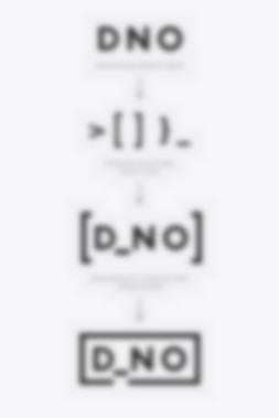
DNO, a subsidiary of DADI, is an emerging tech startup. At the core of the company is a highly sophisticated edge computing service. Our aim was to create a strong brand language which also pays homage to the capabilities of the company. Due to this, the brand identity has been created using symbols regularly found within coding, specifically JavaScript. The letter forms and spacing within the logo were proportioned using the golden ratio.

We used classic typefaces and a clear, bold colour palette which complements DNO’s passionate, decisive and market-disrupting attitude. Along with business cards, letterheads and corporate stationery, we also created comprehensive brand guidelines. This document captures; logo use, typography use, colour palettes and general rules for ensuring a clear and consistent brand message.
Services:
Brand Strategy
Brand Identity
Visualisation